
How I Build My Website
Programming · Apr 25th, 2021
If at any time you want to see the actual source code, just press [Ctrl]+[Shift]+[i] or [Cmd]+[Opt]+[i] for macOS while your browser is open. This key combination will display the inspector of your browser. You can then simply hover over the HTML elements and see how things are actually build up.
Alternatively, you can just type view-source: before the URL, for example like this:
view-source:https://rismosch.com/
With this, you can see the actual HTML. This even works on mobile! By the way, you can do these things with every website, not just mine. So if you ever want to see how Googles HTML looks like, there is literally nothing stopping you to check that out. If you don’t want to do any of that, you can also just check out my GitHub, in which I made all the source code of this website open source.
https://github.com/Rismosch/risWebsite
But since I don’t expect you to read the code and immediately understand everything right away, let’s talk about what I actually build 🙃 Every page is built exactly the same: The body’s background is set to a dark-blue and contains a black <div>. In this <div> there are 4 Elements:
- The Rismosch Banner
- The Selector Tabs
- The Actual Content and
- Some Foot Links

The easiest of these 4 to implement, are the Foot Links. These are literally just a GIF, 4 pictures and 3 links. CSS makes them look nice. That’s literally it.
The next easiest, is the Content, which is just a <div> with grey background, white border and some padding. Again, that’s literally it. Depending on which site you are viewing, different content is displayed in this <div>.
The Banner and Selector tabs are quite a bit more complicated. Let’s start with the Tabs, because these are just pretty CSS magic. I briefly mentioned in the CSS chapter, that HTML Tags can be defined with classes and ids.
<div class="myClass1 myClass2" id="myId"></div>
The main difference between a class and an id is, that a tag can have multiple classes, but only one id. You can easily add and remove, even toggle classes. The Selector Tabs abuse this feature. The tabs are just a horizontal list. Each element has the class selector_tab, which gives them a white border, a dark grey background, white text, and most importantly: A small margin on top. This margin makes it so, that there is a little space above the tab. You will notice that one of the tabs isn’t dark grey though, that is because additionally to the other class, it also has the active_tab class, which overwrites the colors. It also removes the margin on top and makes the tab a little larger. Since the other tabs have this margin while the active one doesn’t, it makes it appear that the active tab is sticking out. Additionally, the margin is also removed, when you hover over the tab, thus making the tab stick out when you hover over them.
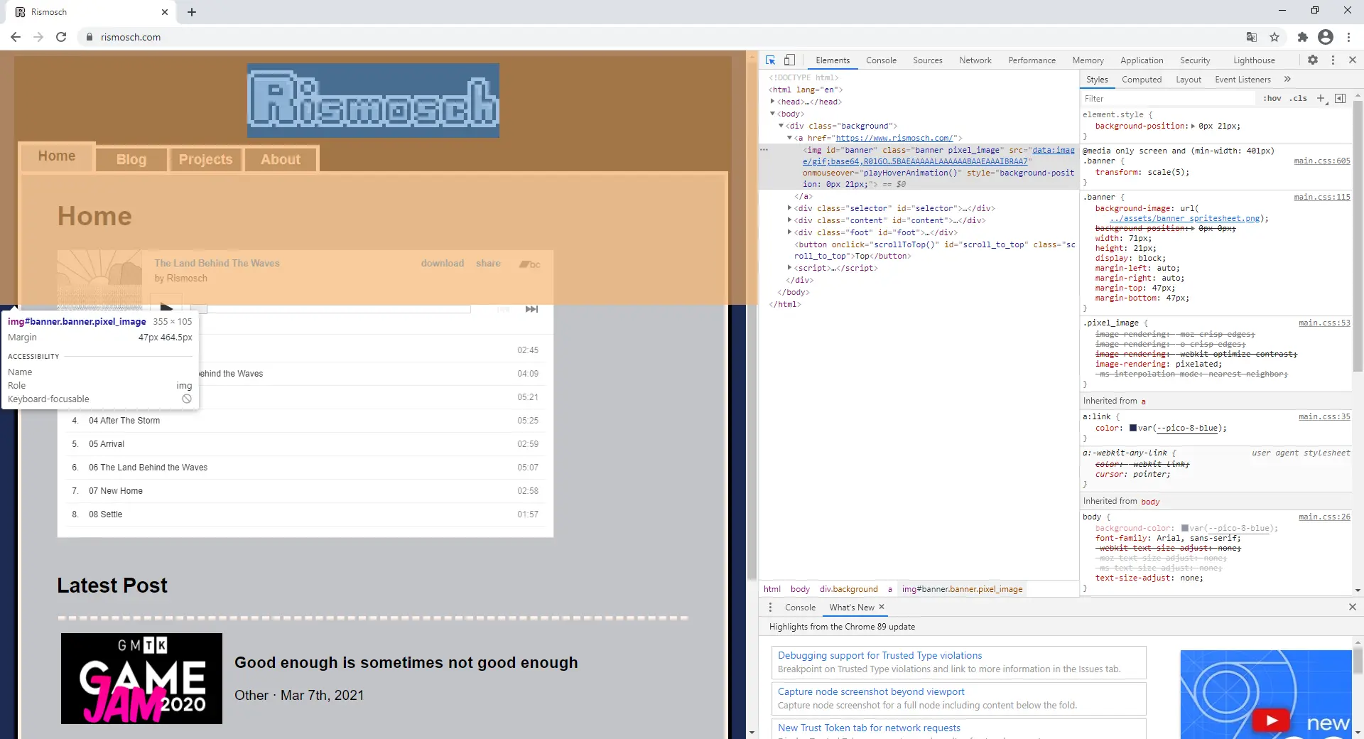
The banner is the most complicated UI Element on my website, and it’s using JavaScript. Essentially, it’s just an <img> tag. This image, has a background image, which is this sprite-sheet:
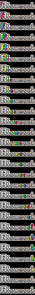
By making the width and height smaller than the whole sheet, the image only shows a small section. Then, with some JavaScript magic, the Background-Position offset is adjusted each frame, thus scrolling through the whole sprite sheet and playing the animation.
What you may have noticed, is that the banner uses pixel art. And when using pixel art, it’s a good idea to only use the resolution required, otherwise your images become unnecessarily big. Setting the width and height of the image bigger than it actually is, or using transform:scale(5) for the banner, which makes the image 5 times larger, we can scale up low resolution pixel art. However, the problem with that is, that scaled up images end up blurred. That is because the browser needs to generate new pixels to make the image bigger, and it usually does this by taking the average of surrounding pixels, which blurs it. In most cases this is the preferred way to upscale images, but not for pixelart, where you want crisp and clearly defined edges. To fix that I have the following selector in my main CSS file:
.pixel_image{

    image-rendering: -moz-crisp-edges;         /* Firefox */

    image-rendering: -o-crisp-edges;           /* Opera */

    image-rendering: -webkit-optimize-contrast;/* Webkit (non-standard naming) */

    image-rendering: pixelated;

    -ms-interpolation-mode: nearest-neighbor;  /* IE (non-standard property) */

}
Now adding the class pixel_image to any upscaled pixelart, creates the result that we want. Below is the same picture twice. However, one has and the other has not the class pixel_image.

The final thing I want to mention is the color scheme that I used. You can actually use variable-like colors with CSS. I wanted to use the PICO-8 color scheme, not that I ever worked with the PICO-8, but because I just like the colors. On the very top of my main CSS I have the following code:
:root{

    --pico-8-black:         #000000;

    --pico-8-blue:          #1d2b53;

    --pico-8-purple:        #7e2553;

    --pico-8-green:         #008751;

    --pico-8-brown:         #ab5236;

    --pico-8-dark-grey:     #5f574f;

    --pico-8-light-grey:    #c2c3c7;

    --pico-8-white:         #fff1e8;

    --pico-8-red:           #ff004d;

    --pico-8-orange:        #ffa300;

    --pico-8-yellow:        #ffec27;

    --pico-8-lime:          #00e436;

    --pico-8-cyan:          #29adff;

    --pico-8-washed-grey:   #83769c;

    --pico-8-pink:          #ff77a8;

    --pico-8-flesh:         #ffccaa;

}
And then in the rest of the CSS I can use these like this:
p{

    color: var(--pico-8-red);

}
When you take a look at my source code, you will notice that every single color in every HTML and CSS uses var(), thus creating a consistent color scheme.
|

| ◀ | Previous Post: HTML, CSS and JavaScript |
| ▶ | More Programming related Posts |